Apex 5 Universal theme, introduces many options to show information in the form of cards , badges. These components are mostly templates , and as Apex 5 comes with templates options, so does these templates. Although, some generic declarative option are there to style the information, to really customize the styling would need the use of custom javascript and css.
Each KPI Card has Five chunks of data identified by the 5 columns of the query. For example:
Therefore, I tried to Introduce these KPI cards to display Numeric targets information with the ease of declaratively styling as much as possible.
Example usage scenarios
- Departmental Actual Revenue/Profit against stipulated targets/goals/objectives.
The Features
- Responsive
- 3 Templates
- Custom No data Found Message
- Page Items to submit
- PPR(AJAX) refreshing in real-time
- Fully Dynamic Options and data(query) values
Demo Application
Github Repository
KPI Numeric Card Illustration
 |
| KPI Numeric Card Illustration |
Using the Query and Column Attributes
Query Template
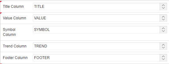
For Each row of the query,the plugin will generate a separate KPI Numeric Card.The Query Columns does not need to be in any particular order as the plugin provided column selection mechanism as following:
 |
| KPI Numeric Card Colums Attributes |
Each KPI Card has Five chunks of data identified by the 5 columns of the query. For example:
Select 'Department A' as Title, 30000 as value, 'up' as trend, '$' as symbol, 'GOAL SET: $25,000/MONTH' as footer from dual
-
Title Column:
-
Data Type: String
-
Required & Possible values include a string like 'First Title' or null
-
If Standard without Title Template is used , then null value can be used in this column and Title can be included in the footer column
-
-
Value Column:
-
Data Type: Number
-
Required & Possible values include a Number or 0(zero) so use NVL(null,0)
-
- Symbol Column:
- Data Type: string
- Optional & Possible values include a string like 'First Title' or null
-
Trend Column:
-
Data Type: String &
-
Optional & Possible values are:
-
up
-
down
-
flat
-
-
- Footer Column:
- Data Type: string
- Optional
Plugin Attributes
Attribute values are comma-separated values, and each value corresponds to each KPI Card, so e.g. the Card Font Color(s) values provided: #3498DB,#3498DB- So first & 2nd KPI Card Font color will have #3498DB value. As can be seen that only 2 values have been provided, So if the query returned more than 2 rows i.e. KPI Cardss, then the third chart will have the default color.
| Option | Description | Type | Default |
|---|---|---|---|
| Template | Template Selection for each KPI Card | Selection(LOV) | Standard Template |
| Column Span(s) | Grid Column Span for each KPI Card | Comma separated number values | 3 |
| Height(s) | Height of the Card Region Body.Some Times due to the styling , large font-sizes , the card region does not expand vertically with font sizes, therefore specifying card size for the region would result in a consistent look. | Comma separated number values(pixels) | 148 |
| Title Bar Background Color(s) | Background color of the title bar | Comma separated or colors/hex-coded values | '' |
| Title Bar Font Color(s) | Font color of the title | Comma separated RGB values | #fff |
| Title Bar Font Size(s) | Fonts Size for the Title. | Comma separated number values(pixels) | |
| Card Background Color(s) | Fill color of the Card Region body. | Comma separated colors/hex-coded values | |
| Card Font Color(s) | Font color of the Symbol & Value. | Comma separated colors/hex-coded values | |
| Card Font Size(s) | Font size of the Symbol & Value. | Comma separated number values(pixels) | |
| Footer Font Color(s) | Font color of the Footer. | Comma separated colors/hex-coded values | |
| Footer Font Size(s) | Font size of the Footer. | Comma separated number values(pixels) | |
| Footer Font Size(s) | number of decimal places to show | Comma separated number values |
 |
| KPI Numeric Card Templates |
 |
| Column Spans 5,4,3 |


