Tuesday, 4 July 2017

July 04, 2017

Oracle APEX Plugin KPI Numeric Cards, Dynamic


Apex 5 Universal theme, introduces many options to show information in the form of cards , badges. These components are mostly templates , and as Apex 5 comes with templates options, so does these templates. Although, some generic declarative option are there to style the information, to really customize the styling would need the use of custom javascript and css.
Therefore, I tried to Introduce these KPI cards to display Numeric targets information with the ease of declaratively styling as much as possible.
Example usage scenarios
  • Departmental Actual Revenue/Profit  against stipulated targets/goals/objectives.

The Features

  • Responsive
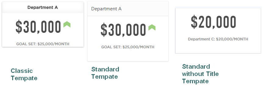
  • 3 Templates
  • Custom No data Found Message
  • Page Items to submit
  • PPR(AJAX) refreshing in real-time
  • Fully Dynamic Options and data(query) values

Demo Application

Github Repository

KPI Numeric Card Illustration

KPI Numeric Card Illustration

Using the Query and Column Attributes

Query Template

For Each row of the query,the plugin will generate a separate KPI Numeric Card.
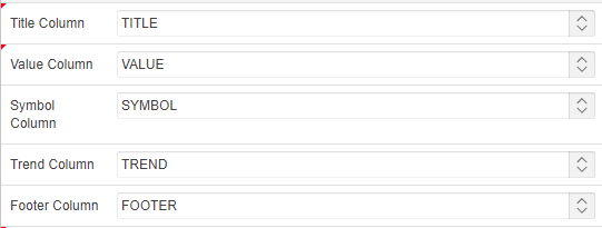
The Query Columns does not need to be in any particular order as the plugin provided column selection mechanism  as following:
KPI Numeric Card Colums Attributes

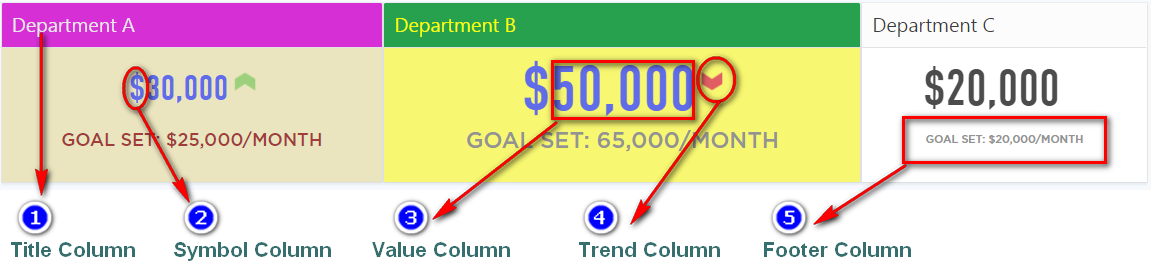
Each KPI Card has Five chunks of data identified by the 5 columns of the query. For example:
Select 'Department A' as Title, 30000 as value, 'up' as trend, '$' as symbol, 'GOAL SET: $25,000/MONTH' as footer from dual
  • Title Column:
    • Data Type: String
    • Required & Possible values include a string like 'First Title' or null
    • If Standard without Title Template is used , then null value can be used in this column and Title can be included in the footer column
  • Value Column:
    • Data Type: Number
    • Required & Possible values include a Number or 0(zero) so use NVL(null,0)
  • Symbol Column:
    • Data Type: string
    • Optional & Possible values include a string like 'First Title' or null
  • Trend Column:
    • Data Type: String &
    • Optional & Possible values are:
      • up
      • down
      • flat
  • Footer Column:
    • Data Type: string
    • Optional
 

Plugin Attributes

Attribute values are comma-separated values, and each value corresponds to each KPI Card, so e.g. the Card Font Color(s) values provided: #3498DB,#3498DB
  • So first & 2nd KPI Card Font color will have #3498DB value. As can be seen that only 2 values have been provided, So if the query returned more than 2 rows i.e. KPI Cardss, then the third chart will have the default color.
Plugin Options
Option Description Type Default
Template Template Selection for each KPI Card Selection(LOV) Standard Template
Column Span(s) Grid Column Span for each KPI Card Comma separated number values 3
Height(s) Height of the Card Region Body.Some Times due to the styling , large font-sizes , the card region does not expand vertically with font sizes, therefore specifying card size for the region would result in a consistent look. Comma separated number values(pixels) 148
Title Bar Background Color(s) Background color of the title bar Comma separated or colors/hex-coded values ''
Title Bar Font Color(s) Font color of the title Comma separated RGB values #fff
Title Bar Font Size(s) Fonts Size for the Title. Comma separated number values(pixels)
Card Background Color(s) Fill color of the Card Region body. Comma separated colors/hex-coded values
Card Font Color(s) Font color of the Symbol & Value. Comma separated colors/hex-coded values
Card Font Size(s) Font size of the Symbol & Value. Comma separated number values(pixels)
Footer Font Color(s) Font color of the Footer. Comma separated colors/hex-coded values
Footer Font Size(s) Font size of the Footer. Comma separated number values(pixels)
Footer Font Size(s) number of decimal places to show Comma separated number values

KPI Numeric Card Templates

Column Spans
Column Spans 5,4,3


Thursday, 22 June 2017

June 22, 2017

Hard-coding vs. Soft-coding in PL/SQL and SQL


Thanksto Steven Feuerstein for his awesome work on pl/sql.
This post is mostly summary and compilation with useful links at the end.
All the files relating to hard-coding can be downloaded from here.🔗

Hard-coding

Hard- coding, usually involves using Literal values, would be fine if nothing ever changed in our applications, only and only if:
  • Requirements, Tables' Definitions, Rules & Formulas and Configuration Constants  stayed the same...
Whenever anything changes, you have to find all the places you explicitly coded it, and fix them.

Soft Coding

– Rather than explicitly code values, rules and algorithms, make them "soft" or dynamic –changeable and settable at runtime.
and here is my definition:

Soft coding involves a way to code the definition , values, rules and algorithms which incorporate such a level of flexibility and manageability that any foreseeable technical and business requirements could be met by it ,without any significant change in the original code.

The concept is
  • Repeat nothing: become allergic to redundant repetition.
  • Aim for a "single point of definition"(SPOD) in everything you write and thus a great tool for refactoring.
  • Information hiding(Data Encapsulation) – Hide, hide, hide: values, implementations, workarounds
    • – Avoid exposing the implementation details of formulas,rules, algorithms, data access.
    • – The more you hide, the more flexibility you have.

  • "Never" and "Always" in software
    • – It's never going to stay the same.
    • – It's always going to change.
 
So Lets take quick look on the various hard-coding and its solutions.
Literal values
  • – Especially language-specific literals, Limits, Statuses,Flags etc. should only be in SPOD
  • Code files:
    • thisuser*.*
    • soft_code_literals.sql
Solution
  • :Hide literals behind:
      • Create a Packaged Constant, assigning the value to that constant.
        • Fast on Retrieval
        • Some time the additional typing need by placing package name as the prefix, however this can be avoided if the constants are used within the package and thus can be defined in the package body and referenced by the constant name directly
      • Create a Function that hides and returns the value.
        • Pros are
          • Encapsulation Hides the value in the Package body
          • and dynamic, easy to refactor
        • Cons are Performance Overhead
          • The function can be deterministic as the value is predetermined(never changing) and there are no external dependencies in the function , and which can add to optimized performance
        • Still more expensive to call a function than to reference a constant
      • Soft code in tables , Store and manage the value in a database table , soft code it.
          • – The Most Dynamic
          • – More complex code
          • – More overhead, but caching can avoid this problem.
Constrained declarations
  • – Every declaration of the form VARCHAR2(N) to be a bug. – Unless it is the SPOD for that type.
  • Code Files:
    • fullname.pks
    • plsql_limits.pks
    • string_tracker3.*
Solution:
  • Instead, anchor the declaration back to its "source".
    • %TYPE for variables based on columns
    • %ROWTYPE for records based on table/cursor
    • –  OR if you can't anchor back to a DB element? use  SUBTYPES for all applications-specific types
      • Critical when working with complex structures like collections of records, and nested collections.
      • Example of the hardcoded values
        l_full_name VARCHAR2(100);
        l_big_string VARCHAR2(32767);
      • And using subtype
        CREATE OR REPLACE PACKAGE employee_rp As
        SUBTYPE fullname_t IS VARCHAR2 (1000);

        Then in your code use
        l_full_name employees_rp.full_name_t;
        l_big_string plsql_limits.maxvarchar2;
    Rules and formulas
    • – Especially the "trivial" ones, more critical than repeated literals
    • – They will change & get more complex.
    • Code Files:
      • get_time.sql
      • sf_timer.*
    Solution
      • – Learn to recognize rules and formulas. Often they are missed, especially when simple.
      • – Hide the logic behind functions.
    • Example: Never trust a rule!
      • DBMS_UTILITY.GET_TIME andGET_CPU_TIME (10g) use to compute elapsed time down to the hundredth of a second
      SQL statements
      • - Every SQL statement that you write is a hard-coding! difficult to contemplate
      • – PL/SQL is, in fact, the best place for SQL.
      • – Follow the principles; they are your guide.
      • – Don't repeat anything!
      Solution
      • :hide SQL inside a data access layer.
        • Think of SQL as a service that is provided to you, not something you write.
        • – Or if you write it, you put it somewhere so that it can be easily found, reused, and maintained.
        • This service consists of programs defined in the data access layer.Known as
          • –  table APIs,
          • –  transaction APIs,
          • –  or data encapsulation
        • these programs contain all the intelligence about business transactions and underlying tables.
        • Pros:
          • Change/improve my implementation with minimal impact on my application code.
            • – The underlying data model is constantly changing.
            • – We can depend on Oracle to add new features.
            • – We learn new ways to take advantage of PL/SQL.
          • Vastly improve my SQL-related error handling.
            • – Do you handle dup_val_on_index for INSERTs,too_many_rows for SELECT INTOs, etc?
          • Greatly increase my productivity
            • – I want to spend as much time as possible implementing business requirements.
        • Cons: checkout the stackoverflow Tapi Vs Xapi discussion in the links at the end 
        • For each table, we have these generated packages:
          • – <table>_CP for DML
          • – <table>_QP for queries
          • – <table>_TP for types
          • And the Coded – <table>_XP "extra stuff" package with custom SQL logic and related code
        • It must be very consistent, well-designed and efficient or it will not be used.
        • Best solution: generate as much of the code as possible.
          • – And any custom SQL statements should be written once and placed in a standard container (usually a package).
      Hide Algorithmic details
      • Assume that whatever you are working on will change – and hide it behind an API.
      • – Logging errors
      • – Function result cache
      • – Manipulating collection contents
      • Code Files:
        • 11g_emplu.pkg
        • string_tracker3.*
        • cc_smartargs.pkb
      • – Example: error logging mechanism
        • We usually, but not always, want to write error information out to a log table.
      WHEN NO_DATA_FOUND THEN
      l_code := SQLCODE;
      INSERT INTO errlog
      VALUES ( l_code, 'No company for id ' || TO_CHAR ( v_id ), 'fixdebt', SYSDATE, USER );
      WHEN OTHERS THEN
      l_code := SQLCODE; l_errm := SQLERRM;
      INSERT INTO errlog
      VALUES (l_code, l_errm, 'fixdebt', SYSDATE, USER );
      RAISE;
      END;
      
        • Now using a shared, generic logging utility , we re-write based on the Quest Error Manager, so You do less work and get more information
        • Download form Here: Quest Error Manager
      WHEN NO_DATA_FOUND
      THEN
      q$error_manager.register_error (text_in => 'No company for id ' || TO_CHAR ( v_id ));
      WHEN OTHERS
      THEN
      q$error_manager.raise_unanticipated (name1_in => 'COMPANY_ID', value1_in => v_id);
      END;
      
        • The Oracle11g function result cache
          • The optimal way to query and cache data changes over time.
            • – Explicit and implicit cursors
            • – FORALL and BULK COLLECT
            • – And now the function result cache
          • With the Result Cache,provided the same(matching) inputs as parameters the  function return the data previously cached with  
      FUNCTION onerow (employee_id_in IN employees.employee_id%TYPE)
      RETURN employees%ROWTYPE RESULT_CACHE;
      
        • Manipulating collection contents
          • Collections are Oracle's version of arrays in PL/SQL.
          • – A relatively complicated but critically important data type.
          • Best to hide collection references behind procedures and functions.
          • – Especially when you work with string-indexed and multi-level collections.

      Further Reading

      PDFs
      Say-Goodbye-to-Hard_2D00_Coding.pdf
      Hardcoding 1
      Hard Coding 2

      Hardcoding

      YouTube -Hard Coding Playlist
      https://www.toadworld.com/platforms/oracle/b/weblog/archive/2011/09/15/avoiding-hard-coded-values-in-views
      https://jeffkemponoracle.com/2010/03/02/please-hard-code-your-literals/
      http://pretius.com/how-to-avoid-hard-coding-in-your-plsql-code/

      SQL hardcoding , TAPIs, XAPIs & Data Access Layer

      https://jeffkemponoracle.com/2010/06/23/tapi-vs-xapi/
      https://stackoverflow.com/questions/3092041/understanding-the-differences-between-table-and-transaction-apis?answertab=active#tab-top

      Wednesday, 3 May 2017

      May 03, 2017

      Oracle APEX Plugin Circliful Gauge , Fully Dynamic


      The underlying concept is to show some kind of target /usage percentage with or without absolute values,Icon or Target Percentage.

      Example usage scenarios
      • Departmental Performance/Cost percentages,  e.g. Dept A 30%, Dept B 70%
      • Orders Completed by Department either absolute values or percentages
      • Statistic like World Population by continent showing absolute values or proportions(percentages)

      The Features

      • Fully Responsive
      • Font awesome icons supported
      • 3 Templates
      • Custom No data Found Message
      • Page Items to submit
      • PPR(AJAX) refreshing in realtime
      • Fully Dynamic Options and data(query) values
      • Half Circle Option
      • Animation

      Demo Application

      Github Repository

      Circliful Gauge Illustration

      Circliful Gauge Illustration  Fig 1
      Circliful Gauge Illustration  Fig 1
      Circliful Gauge Illustration  Fig 2
      Circliful Gauge Illustration  Fig 2

      Using the Query Template and Column Combinations

      Query Template

      For Each row of the query,the plugin will generate a separate gauge chart.
      The Query template is positional & progressive(see below column combinations) and must be followed strictly, Like the dynamic list query template. Here is an example with explanation :
      Each gauge has Five chunks of data identified by the 5 columns of the query. For example:
      Select 'First Title' as Title, 30 as percent, 80 as TargetPecent , 'fa-plane' as icon,  ‘$ 5 M’ as displayValue from dual
      
      • First Column:
        • Title
        • Data Type: String
        • Required & Possible values include a string like 'First Title' or null
      • 2nd Column:
        • Percentage
        • Data Type: Number
        • Required & Possible values include a Number or 0(zero) so use NVL(null,0)
        • This is the main column on which the circumferential segment of the circle/ring is highlighted
      • 3rd Column:
        • Target Percentage
        • Data Type: String &
        • Optional & Possible values include a string like Number or 0(zero) so use NVL(null,0) , 0  means not provided.
      • 4th Column:
        • Font Awesome Icon
        • Data Type: string
        • Optional & Possible values include a string like 'First Title' or null
      • 5th Column:
        • Display Value
        • Data Type: string
        • Optional & Possible values include a string like 'First Title' or null
        • This value will be display instead of the percentage column value
      Column Combinations
      The Query template is progressive and thus for each combination more columns would be required.
      So here are some combinations
      • Title with Percentage 
        • Only the First 2 columns 
          Select 'First Title' as Title, 30 as percent
          are required
      • Title with Percentage & Target Percentage
        • Only the First 3 columns 
          Select 'First Title' as Title, 30 as percent, 80 as TargetPecent
            are required
      • Title with Percentage ,Target Percentage &  Icon
        • Only the First 4 columns 
          Select 'First Title' as Title, 30 as percent, 80 as TargetPecent , 'fa-plan' as icon
          
          are required
      • Title with Percentage ,Target Percentage ,Icon & display Value
        • All the 5 columns 
          Select 'First Title' as Title, 30 as percent, 80 as TargetPecent , 'fa-plan' as icon,‘$ 5 M’ as displayValue
          
          are required
      • Title with Percentage &  Display Value
        • All the 5 columns 
          Select 'First Title' as Title, 30 as percent, 0 as TargetPecent , null as icon,‘$ 5 M’ as displayValue 
          
        • In order to skip the middle columns use 0 for Number type column and null for string type
      • Title with Percentage , Target Percentage &  Display Value
        • All the 5 columns 
          Select 'First Title' as Title, 30 as percent, 80 as TargetPecent , null as icon,‘$ 5 M’ as displayValue 
          
        • In order to skip the middle columns use 0 for Number type column and null for string type
      • Title with Percentage ,icon &  Display Value
        • All the 5 columns 
          Select 'First Title' as Title, 30 as percent, 0 as TargetPecent , ‘fa-plane’ as icon,‘$ 5 M’ as displayValue 
          
        • In order to skip the middle columns use 0 for Number type column and null for string type
      There is also an icon attribute. which is comma-separated font-awesome icons. Each chart looks for an icon in the query, if ‘null’ icon is specified , then it will extract the icon from the icon(s) attribute and display it if there is any specified.
      Since man is slave to habits , and habits yield routines and routines willingly or unwillingly becomes patterns. The whole process of following the query template and column combinations is the concept of following a pattern, and the goal is to get the columns in the required order and data type in APEX designer .
      Make sure that in APEX Page designer the order is also aligned with the query template as following:
      Query Template Columns Order
      Query Template Columns Order

      Plugin Attributes

      Attribute values are comma-separated values, and each value corresponds to each chart, so e.g. the Inner Circle Color values provided: #3498DB,#3498DB
      • So first & 2nd chart inner circle color will have #3498DB value. As can be seen that only 2 values have been provided, So if the query returned more than 2 rows i.e. gauge charts, then the third chart will have the default values from the table below.
      Some Attributes can have a values of comma-separated pair of semi-colon separated values, e.g This value is from the World Population example.
      Title From Top(Y);Left(X) (s) : 25;75,25;75,25;75,25;75,25;75,25;75
      Plugin Options
      Option Description Type Default
      Chart Template Template Selection for each Chart Selection(LOV)
      Column Span(s) Grid Column Span for each chart Comma separated number values 3
      Title CSS Style(s) CSS inline style you want to add to your title text caret/power(^) separated css style for each chart title ''
      Title Color(s) font color of the title Comma separated RGB values #666
      Title From Top(Y);Left(X) (s) Vertical & horizontal position of the title Comma separated pairs, each pair is semi-colon separated integers null
      Animation Step(s) can be 1 to 10,slow to fast the animation should be Comma separated number values 5
      Percent Text Size font size of the percentage text Comma separated number values 22
      Percentage Value From Top(Y);Left(X) (s) Vertical & horizontal position of the percentage text Comma separated pairs, each pair is semi-colon separated integers 100
      Half Circle whether to draw half circle Comma separated N/Y values N
      Percent Font Color color of the percentage Comma separated RGB values #aaa
      Percentage Decimals Precision number of decimal places to show Comma separated number values 0
      Target Value Font Color(s) Color of the target percentage & circumferential segment Comma separated RGB values #2980B9
      Target Value Font Size(s) font size of the target percentage Comma separated number values 17
      Icon(s) Font-awesome icons to display Comma separated font-awesome icons
      Icon Size(s) font size of the icon(s) Comma separated number values 30
      Icon Color(s) color of the icon Comma separated RGB values #ccc
      Icon Position(s) position of the icon (top, bottom, left, right or middle) Comma separated predefined values
      Percent Circumferential Segment Color(s) color of the Percent Circumferential Segment Comma separated RGB or string values #3498DB
      Percent Circumferential Segment Width(s) width of Percent Circumferential Segment  border Comma separated number values 15
      Inner Circle Size(s) Size of inner circle Comma separated number values 28.5
      Inner Circle Color(s) Fill color of inner circle Comma separated RGB or string values none
      Middle Circle Color(s) Fill color of Middle Circle Comma separated RGB or string values none
      Outer Circle Color(s) Fill color of Outer Circle Comma separated RGB or string values #eee
      Outer Circle Border Width(s) Width of Outer Circle border Comma separated number values 15
      Text Below aligns the Tiltle centered below the circle Checkbox Selection Not Selected
      Animation whether circle should be animated initially Checkbox Selection Selected
      Animation InView Animation only when the chart is in view. i.e in focus Checkbox Selection Not Selected
      Animation with decimals Shows decimals while animating instead of only at the end of the animation Checkbox Selection Not Selected
      Show Percent To show/hide the  percentage(%) sign Checkbox Selection Selected
      No Percent Sign To show/hide the percentage(%) sign Checkbox Selection Not Selected
      Multi Percentage Changes the view for certain column combinations Checkbox Selection Not Selected

      Chart Templates
      Chart Templates

      Column Spans
      Column Spans 5,4,3


      Sunday, 23 April 2017

      April 23, 2017

      Oracle APEX dynamic Action Plugin Atom Calculator

      Atom Calculator is a dynamic action plugin that allows users to perform calculations in real time during data entry by providing a popup calculator for the Input and get the final result.


      Donation

      Your support means a lot.
      Donate

      Changelog


      1.0 - Initial Release


      Install

      • Import plugin file "dynamic_action_plugin_com_planetapex_atom_calculator.sql" from src  directory in the git Hub repository  into your application
      • (Optional) Deploy the CSS/JS files from "src" directory on your webserver and change the "File Prefix" to webservers folder.

      Preview


      Oracle Apex Atom Calculator Plugin
      Oracle Apex Atom Calculator Plugin

      Demo Application

      Atom Calculator Application

      Plugin Features

      • 2 Views to choose from.
      • Custom Calculator Font Awesome Icon.
      • Text Alignment
      • Various On Show events like click, focus
      • 10 Display Positions to choose from.
      • 3 Themes to choose from.
      • 3 Button Styles.
      • Custom offset to adjust the display position.
      • Button Press Animation.
      • Keyboard Numeric Keypad for calculation.
      • Running Total Cacluations.
      • Read Only option.
      • Up to 8 decimal points rounding.

      Plugin Settings


      Atom Calculator Views

      Users have 2 options for the atom calculator view:
      • Basic view displays calculator without the percentage, PlusMinus and Keys.
      • Extended view will display all the keys.

      Styling

      Themes and Button Styles can be used to style the Atom calculator.
      There are 3 themes provided:
      • Light
      • Dark
      • Matetial
      There are 3 Button Styles:
      • No Style, which is Flat
      • Style 1
      • Style 2

      Show Method

      Selects the method when the atom calculator displays.
      Available options include:


      On item click
      The atom calculator pop-up displays when the item is clicked.
      On icon click
      The atom calculator pop-up displays when the icon is clicked.
      On item and icon click
      The atom calculator displays when the item or icon is clicked.
      On focus
      The atom calculator pop-up displays as soon as the item receives focus.


      Display Position

      Position of atom calculator is relative to text input.
      • First value is name of main axis, and
      • Second value is whether the atom calculator is rendered as
        • Left(Leftwards)
        • Right(Rightwards)
        • Up(Upwards)
        • Bottom(Downwards)
      Available options include:
      • Bottom Left
      • Bottom Center
      • Bottom Right
      • Right Bottom
      • Right Top
      • Top Left
      • Top Center
      • Top Right
      • Left Top
      • Left Bottom
      Examples
      Right Top will set atom calculator's position from right side upwards of text input.

      Monday, 10 April 2017

      April 10, 2017

      How to use Font Awesome Animation Library in Applications

      Since Oracle Apex (Apex ) already incorporates the amazing font awesome icons library . Its time to add some dazzle to those static icons. Font awesome already has a few animation parlor tricks up it's sleeves. However, I found that adding some of these extra animations wouldn't hurt.

      So lets dive in
      • Get the Font Awesome Animation Library from download .
      • Upload the minified CSS under the Shared Components =>  Static Application Files
        Check out How to upload section in the How to add CSS Files to Applications.
      • Once uploaded, copy and remember the the Reference e.g.
        #APP_IMAGES#css/font-awesome-animation.min.css
      • Add Font Awesome Animation Library to the Application at the User Interface Level so that Its available through out the Application.
        Check out the User Interface Level section in How to add CSS Files to Applications.

      Using Font Awesome Animation

      Now, adding animation to the font awesome icon is a matter of adding the relevant CSS classes.
      Here are a few concepts:
      • To start animation on document load use "animated" class
      • To start animation on hover use "animated-hover" class
      • To start animation on hover over the parent element use  "faa-parent animated-hover" classes
      • For animation speed , not specifying any speed class would render as standard, or use "fa-slow" or "fa-fast".
      Here are the animation classes which you get from the website:
      • faa-wrench
      • faa-ring
      • faa-horizontal
      • faa-vertical
      • faa-flash
      • faa-bounce
      • faa-spin
      • faa-float
      • faa-pulse
      • faa-shake
      • faa-tada
      • faa-passing
      • faa-passing-reverse
      • faa-burst
      An example would be to use the following classes
      faa-tada faa-parent animated-hover fa-slow
      Font Awesome Animation can be applied to any component on the page, whether the component is using font awesome icon or not.
      Checkout this

      Demo Animated Application

      Applying Font Awesome Animation to a Button

      Create 3 Buttons in a region  as following:

      APEX Font Awesome Animation


      APEX Font Awesome Animation
      APEX Font Awesome Animation
      APEX Font Awesome Animation


      Icon Only Animation

      Vista Theme
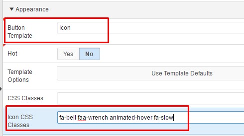
      If you want to animate the icon only  and not the parent i.e button element ,you can enter the font awesome icon class as well as the animation classes in the Button Attributes => Icon CSS Classes attribute as shown in the image above. e.g fa-bell faa-wrench animated-hover fa-slow

          OR you can assign static id to each button,  I have assigned gear id to a button,  and then Go to Page Attributes => Execute when Page Loads and add the following.

      apex.jQuery('#gear span').addClass('faa-spin animated fa-slow');


      Vita Theme Issue
      In Vita Theme, the Hover effect does not work. So I have devised a solution using jQuery
      As an example the button has the following attributes:
      id:bell
      Icon CSS Classes:fa-bell faa-wrench fa-slow

      Page Attributes => Execute when Page Loads and add the following.

      $('#bell')
      .on('mouseover', function () {
      $(this).find('span:first').addClass('animated');
      })
      .on('mouseout', function () {
      $(this).find('span:first').removeClass('animated');
      })
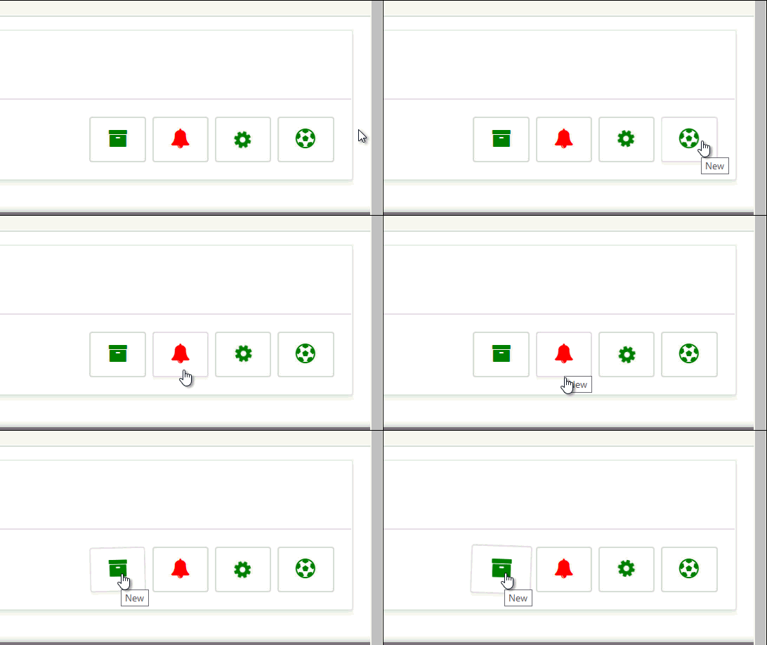


      APEX Font Awesome Button Animation
      Font Awesome Button Animation

      Applying Font Awesome Animation to Side Navigation Bar

      I am using the standard side bar navigation template. Since Standard templates do not allowing editing that’s why you have to copy and edit the new template.
      Go to Shared Components =>User Interface Section=> Templates => Copy Side Navigation Menu to Side Navigation Menu New => Edit Side Navigation Menu New template => Side Navigation Menu New => Execute when Page Loads
      and add the following:
      $('#t_TreeNav .a-TreeView-node').addClass('faa-pulse faa-parent animated-hover fa-slow');
      
      Make it your default template.
      Go to Shared Components => User Interface => User Interface Attributes => Edit User Interface => Navigation Menu => List Template => Side Navigation Menu New
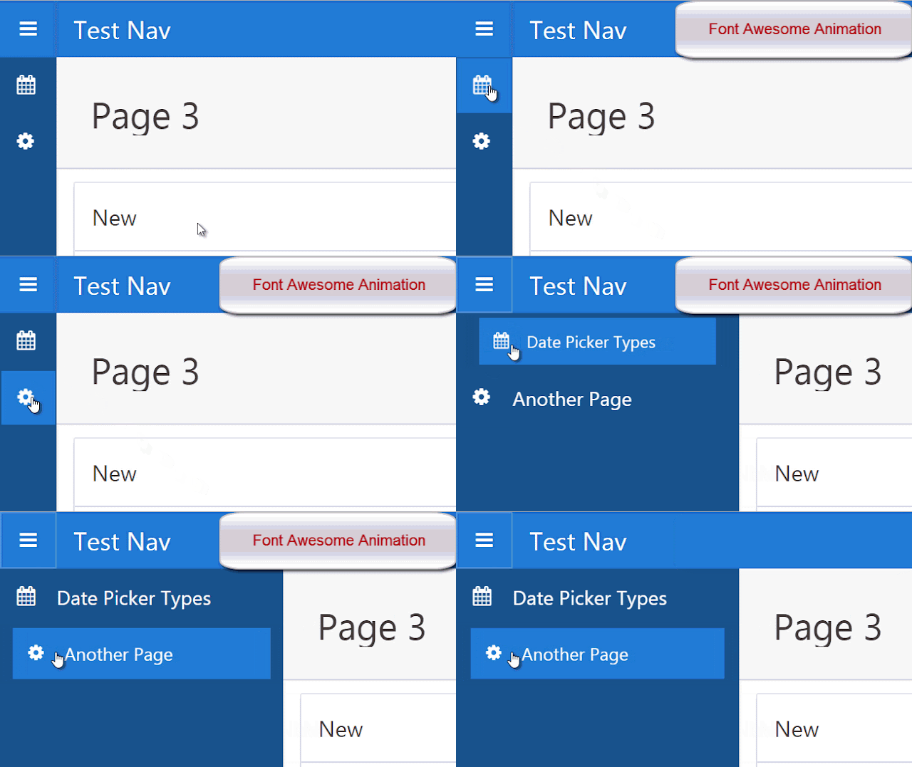
      Apex Font Awesome Side Menu Navigation Animation
      Font Awesome Side Menu Navigation Animation
      I have to say that imagination is your limit and practice your tool. So e.g if you wanted to use different animation for each navigation item

      You may

      • Create a New Side Bar Navigation Template and use the A01...A10 substitutions in the relavent places to be later replaced by animation classes from the list query. 

      OR
      •  Use javascript e.g set a class  lets say anim-item  along with animation classes for all items in the list definition :
             
      Shortened Code snippet
        select null as lvl 'Date Picker Types' as label,
            'fa-calendar anim-item ==faa-pulse animated-hover fa-slow==' as icon,
      Union All
      select null as lvl,
             'Another Page' as label,
             'fa-cog anim-item ==faa-spin animated-hover fa-slow==' as icon,

      • then in Side Navigation Menu New  Template => Execute when Page Loads 
         use jquery selector $('anim-item') and foreach , extract the class string and remove the  ==faa-spin animated-hover fa-slow==  from class of that item and then traverse through parents till you reach the Side bar Navigation Item and addClass  faa-spin animated-hover fa-slow to it , so each  Item will have it's own animation.


      Side Navigation Bar Icons Only Animation


      If you want to animate the Icons only then keep the standard Side Navigation Template , However use a List based on the following query :

      select null as lvl,
             'Date Picker Types' as label,
             'f?p=' || :APP_ID || ':10:' || :APP_SESSION as target,
              10 as c,
             'fa-calendar faa-pulse animated-hover fa-slow' as icon,
              null as ia,
             null as iaa,
             null as attribute1,
             null as attribute2,
              null as attribute3,
             'title' as attribute4     
      from dual
      Union All
      select null as lvl,
             'Another Page' as label,
             'f?p=' || :APP_ID || ':11:' || :APP_SESSION as target,
              11 as c,
             'fa-cog faa-spin animated-hover fa-slow' as icon,
              null as ia,
             null as iaa,
             null as attribute1,
             null as attribute2,
              null as attribute3,
             'title' as attribute4   
      from dual
      Union All
      select null as lvl,
             'Yet Another Page' as label,
             'f?p=' || :APP_ID || ':12:' || :APP_SESSION as target,
              12 as c,
             'fa-bell faa-wrench animated-hover fa-slow' as icon,
              null as ia,
             null as iaa,
             null as attribute1,
             null as attribute2,
              null as attribute3,
             'title' as attribute4   
      from dual
      Union All
      select null as lvl,
             'Almost there' as label,
             'f?p=' || :APP_ID || ':13:' || :APP_SESSION as target,
              13 as c,
             'fa-bicycle faa-passing animated-hover fa-slow' as icon,
              null as ia,
             null as iaa,
             null as attribute1,
             null as attribute2,
              null as attribute3,
             'title' as attribute4   
      from dual
      Union All
      select null as lvl,
             'Not So Far' as label,
             'f?p=' || :APP_ID || ':14:' || :APP_SESSION as target,
              14 as c,
             'fa-fighter-jet faa-horizontal animated-hover fa-slow' as icon,
              null as ia,
             null as iaa,
             null as attribute1,
             null as attribute2,
              null as attribute3,
             'title' as attribute4   
      from dual


      Saturday, 8 April 2017

      April 08, 2017

      How To Add Custom CSS Files To APEX Application

      How To Add Custom CSS Files To APEX Application

      CSS can be added to APEX application inline or as CSS File(s). We all know how web developers suggest on keeping the presentation, content and behaviour separately. So as a good practice for production applications, we should place all our Inline CSS in CSS files.

      Depending on your requirements, you can add custom CSS Files to your application at the
      • Page Level
      • Page Template Level
      • Theme Style Level
      • Theme Level
      • User Interface Level

      Uploading files to Apex


      A short primer on uploading the CSS files before adding to application The first thing you need to do is storing your file in a location which can be easily available to APEX.

      The files can be uploaded to APEX or placed in the Image path folder.

      Uploading files to Apex can be done via the Shared Components =>  Files Section

      Application Static Files
      Static Application Files are local to the application as the name suggests.
      Static Workspace Files are local to the workspace and thus to all application sharing the workspace.

      Files placed from OS in Image Prefix directory can be accessed by all Workspaces and Applications.

      When a file is uploaded to APEX, it will provide a reference like:
       #APP_IMAGES#css/fonta.min.css
       #WORKSPACE_IMAGES#css/fonta.min.css

      When fonta.min.css is placed in a css folder in Image Prefix directory on the server, can be referenced as

      #IMAGE_PREFIX#css/fonta.min.css

      Ok, Now Lets get back to add CSS Files to APEX.

      Page Level


      Placing CSS File at the Page Level will restrict it only to the specific page.

      For Page Level add your CSS Files reference to Page Definition =>  CSS => File URLs
      APEX Page Definition CSS URL
      Page Definition CSS URL

      Page Template Level


      Placing CSS at the Page Template Level will make the CSS available to all the pages using the specific Page Template. This can be used for specific pages to use CSS customization. However for the entire application, you will have to edit each of the Page template.

      Go to Shared Components =>User Interface Section=>Themes=> Tasks list => View Templates.

      Let's say I use Standard Template , So copy it and name it something like Standard Template New.
      Select the name of the page template you want to edit.

      Use a <link> tag within the head section to reference the appropriate style sheet.

      Go to the Header Section Text area

      Find #HEAD# substitution and add the following below it.


       So that its looks like below
      Template Definition
      Now make the Standard Template New your theme default page by going to Shared Components => Themes => Create / Edit Theme , then go to the component defaults and set your page template to Standard Template New.

      Also you have to make sure that you add
       <link type="text/css" rel="stylesheet" href="#APP_IMAGES#css/fonta.min.css" >
       to each of your page templates that you would use.

      Theme Style Level

      This can be used to make CSS File available across the entire application. However as the name suggest the CSS Files are specific to the Style in use.

      Start using another Style from Theme roller for example, and you will loose the CSS file availability.

      Go to Shared Components => Themes => Create / Edit Theme => Styles Section
      Apex Them Styles
      Theme Styles
      Go to  Settings => Files URLs and add the your CSS reference URL
      #IMAGE_PREFIX#css/fonta.min.css
      Apex Theme Style Definition
      Theme Style Definition

      Theme Level


      Theme Level can be used to integrate custom font icons libraries as is suggested in the following post:

      Apex 5.0 Font Awesome Integration

       Its a great way for CSS Masters to user their own font icon libraries in Apex Applications.

      User Interface Level

      In APEX 5 and onwards , User Interface provides a centralized place to add your custom CSS file to the Entire Application.

      So no need to mess around with Themes, Page Templates and Styles.

      Just add as following:

      Go to Shared Components =>  User Attributes  => Edit User Interface =>  CSS File URLs Section
      APEX User Interface Attributes
      User Interface Attributes


      APEX User Interface Edit
      User Interface Edit


      APEX User Interface CSS URL
      User Interface CSS URL


      A reev a dérchi for now.